THE LABORATORY REPORT
The report you turn in after completion of each series of experiments is the main product of the team’s work which will be used for grading. Therefore you should devote enough attention to this final but critical step in the laboratory experience. Writing good technical reports is a valuable skill, which in the future will help advance you professional career. Start practicing it now.
The purpose of the laboratory report is to provide information on the measurement procedure, obtained results, analysis, and interpretation and discussion of these results. The discussion and conclusions are very important in a report because they show what knowledge you gained by doing the experiments.
There is no one best format for all technical reports but there are a few simple rules concerning technical presentations which should be followed:
- Number report pages and report sections (see sections below).
- Number all figures in the order as they appear in the report text. All figures should have captions below the figure, with the figure number and the text describing its contents. For example: "Fig. 1 Circuit for measuring forward bias diode characteristic" or "Fig. 4 Reverse bias characteristic of 1N4001 diode with a linear trendline". Place each figure close to the text in which it is first mentioned. Note that schematics, charts, or pictures of waveforms are all figures. Make references to figure numbers in the text discussing the data.
- Number all tables and give them titles; they should be placed on top of tables (not below like figure captions). Place tables close to the text in which they are is first mentioned. Make references to table numbers in the text discussing the data.
Divide the report into the following sections:
- Cover Page
- Introduction
- Procedure
- Experimental Data
- Discussion
- Conclusions
If a laboratory experiments consist of different parts, divide each section accordingly, referring to the parts described in the laboratory manual.
- The Cover Page should have the names of the team members, and a designation such as Group 3, if the groups are numbered, section and course numbers (e.g. EE291, Section 003). It should also contain the number and the title of the experiments, such as “Experiments VII RC circuits; Passive filters”. Cover page should also have the date of the report delivery, not the due date.
- The Introduction should contain a brief statement in which you state the objectives, or goals of the experiments. It should also help guide the reader through the report by stating, for example, that experiments were done with three different circuits or consisted of two parts etc. or that additional calculations or data sheets can be found in the appendix. It is also a good place to state that the experimental results were as expected or that there were some problems, as explained in the Conclusions. You may state what was learned in this set of experiments.
- The Procedure describes the experimental setup and how the measurements were made. Include here circuit schematics with the values of components. List the instruments used, their settings and describe any special measurement procedure that was used. This section can be very brief but schematics with the component values actually used in the experiments (such as R, C) are necessary.
- The Experimental Data section should be presented clearly with a reference to the procedure the schematic used in measurements. Tables are often a good way of presenting results. This section can also include some calculations or data analysis. For example, in describing the measurements of a frequency distribution, make a table with frequency in one column and the peak-to-peak voltage measured with an oscilloscope in another. The third column might contain the voltage rms values, calculated from the first column, which may be compared with the data obtained with a voltmeter, listed in fourth column. Another column may contain values calculated from theory.
In many student’s reports in the past there was not enough information in this section. For example, when reporting measurement of an amplifier gain, input and output voltages were recorded but no information would be given on the frequency at which the measurements were performed or whether the data were taken with a voltmeter or an oscilloscope. Remember: giving more information is not a mistake, less may be.
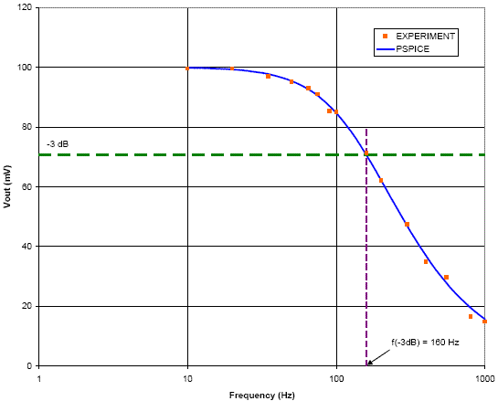
The best form of presentation of some of the data is graphical. In engineering presentations a picture is often worth more than a thousand words. There are some simple rules concerning graphs and figures which should always be followed. If there is more than one figure in the report, the figures should be numbered. Each figure must have a caption following the number. For example: Fig. 1 Schematic of the resonance circuit used in experiment 1, or Fig. 3. Dependence of voltage VR on frequency. All components in the schematics should be labeled with symbols (C1, R2) or values (10 nF, 100k). If symbols are used, particular values used in experiments should be listed in the text. All graphs, beside captions, should have clearly labeled axes. Axes, beside labels, should have scales and units. For example, in a graph of a diode characteristic, a horizontal axis may be labeled with a symbol VD and have marks (ticks) indicating voltage scale: 0.1, 0.2, 0.3, etc. with the word “volts” or symbol V written under the axis. Similarly the vertical axis may have symbol ID, for current, with numbers and units designated by the symbol mA, for miliamperes. The lack of proper figure identification and labeling is a very often seen shortcoming in student’s reports.
Use a computer to plot data obtained from your measurements. Represent measured values on the plots by symbols such as dots, circles, squares etc. When appropriate, plot theoretical curves on the same graphs. Theoretical curves can be obtained by plotting results of calculations for many points on the graphs, so that continuous lines are formed. Spreadsheet programs (such as MS Excel™) may be used for this purpose or math programs (like Matlab®), as well as specialized graphic software. For circuit simulation a programs MULTISIM is used in this course.
Plots, such as frequency responses or waveforms simulated by MULTISIM can be easily exported to MS Excel™, or other graphic programs (see next chapter of this manual).
Matlab is available free of charge as part of the software package distributed to NJIT students. Additional information may be obtained from www.mathworks.com.
Assignments for simulation of some circuits studied in this laboratory are described in this manual. The best way to compare experimental data with simulations is to plot them on the same graph. You will have to export Multisim simulation data to a spreadsheet to present them together with experimental points on the same graph. - The Discussion is a critical part of the report which testify to the student’s understanding of the experiments and its purpose. In this part of the report you should compare the expected outcome of the experiment, such as derived from theory or computer simulation, with the measured value. Before you can make such comparison you may have to do some data analysis or manipulation. The simplest example would be conversion of peak to peak voltage obtained from an oscilloscope to rms values or conversion of a waveform period to frequency. When comparing experimental data with numbers obtained from theory, make very clear which is which.
The best way of analyzing strings of data, such as a frequency distribution, is to make an appropriate graph on which the theory is represented by a continuous curve and experimental data by points, as described in the previous section. In such case you do not need to join the points with a continuous line; their distance from the curve will be the measure of agreement between the experiment and theory. If there is no theoretical curve on the graph, the data points may be joined by a continuous line which is to represent the measured function. A caution is advised if there are just a few data points on the graph. Computers may draw a meaningless zigzag stick figure through scattered points. You may do a much better job by drawing a smooth line between the points by hand, unless you use software with capabilities of fitting a spline or other function, based on statistical analysis of the data.
A critical part of discussion is error analysis. In comparison of theory and experiment you may not get and usually do not get a perfect agreement. Sometimes the agreement is poor. It does not necessarily mean that your experiment was a failure. The results will be accepted, provided that you can account for the discrepancy. Precision and accuracy of the instruments or your ability to read the scales may be one limitation. The value of some circuit components may not be well known and a nominal value given by the manufacturer does not always correspond to reality. Very often, however, the reason for the difference between the expected and measured values lies in the experimental procedure or in not taking into account all factors that enter into analysis. A good example comes from a student’s report. Low-pass filter characteristic obtained by measuring voltage across a capacitor did not agree with the theoretical curve. The measurements appeared to be precise and the scatter of experimental points was negligible. The instructor pointed out a small value of capacitance, which students choose for the filter. After some discussion they realized that the capacitance of the cable connecting the circuit to the meter changed its characteristics. When this capacitance was taken into account the agreement was quite good and the report was accepted. The above example shows that data analysis requires an open mind and a critical approach to your own work and that routine methods may not be sufficient. - The Conclusions should contain several short statements closing a report. They should inform the reader if the experiments agreed with the theory. If there were differences between measured and expected results, try to explain possible reasons for these differences. You may also say what could have been done differently, how experiments may be improved, or make other comments on the laboratory. Constructive and original statements are highly valued.
An example of a professional quality graph generated by Excel: